


Jolly Font
La jolly font est un travail typographique où les mots rejoignent les images, se mêlent et se parlent, tant par la forme que par le langage. Un bout à part entière d’un projet plus grand, la continuité d’une poésie douce et plurielle.
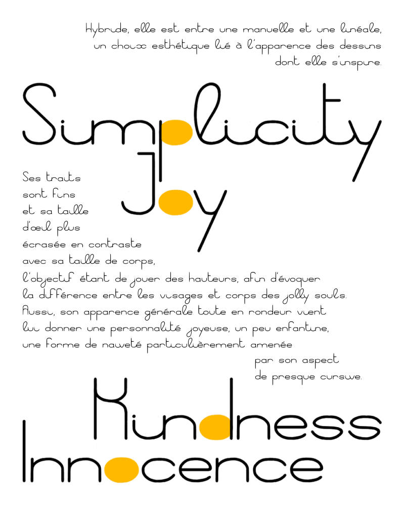
The Jolly Font is a typographic work where words join images, blend together, and speak to each other through both form and language. A separate piece of a larger project, the continuation of a gentle poetry.

This typography is made to coexist with my characters, using their features, their faces. Made of curves and ovals, it uses the heads of the jolly souls as a base and forms its loops by drawing inspiration from their sleeves. It is part of an illustration project and is therefore built for it, but I seeked, here, an aesthetic neutral enough to be used in other contexts. The jolly font is above all a typography intended to be joyful and pleasant to read.


A hybrid, somewhere between a manual and a linear, an aesthetic choice linked to the appearance of the drawings from which it draws inspiration. Its features are thin and its x-height is more squashed in contrast to its point size, the objective being to play with heights, in order to evoke the difference between the faces and bodies of the jolly souls. Also, its general rounded appearance gives it a joyful, slightly childish personality, a form of “naivety” particularly brought about by its almost cursive appearance.

Given the manual appearance of this typeface, I decided to create ligatures to provide flexibility and greater consistency between my characters. Thus, three letters are linked with their neighbor : ilt. With the exception of the s, x, and z, not linkable for aesthetic reasons. These ligatures are not mandatory, and the jolly font remains readable and consistent without them.

The Jolly font is also complemented by several marks. It is composed of 86 characters and can still be expanded.

Quelques Recherches
Some Research


Créez votre propre site internet avec Webador