

La Treto
Typographie
La Treto est un projet fictif d’identité typographique pour le théâtre itinérant “les Tréteaux de France”. Un moyen de relier mes compétences typographiques, graphiques et de motion design.
La Treto is a fictional typographic identity project for the traveling theater “Les Tréteaux de France.” It’s a way to combine my typographic, graphic, and motion design skills.

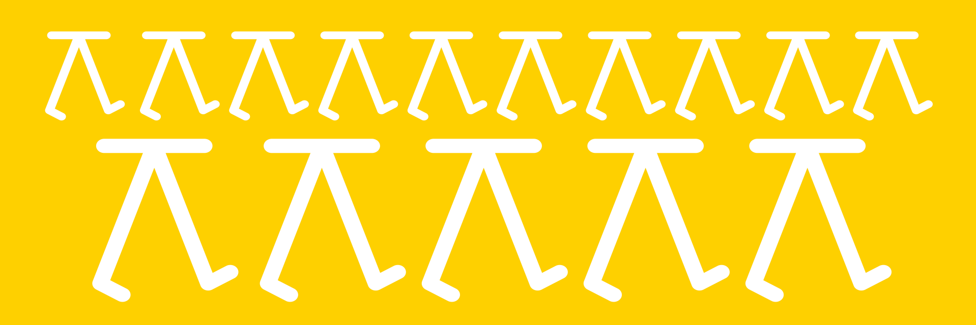
The TRETO, a font that goes at its own pace :
The Treto is inspired and intended for the national theater “les Tréteaux de France” (“the Trestles of France”). Un itinerant theatre with the objective of bringing their art where it is difficult to have access to it.
For this typographic work I wanted to represent this movement, this wander. Putting to action a trestle, which is a very distinctive form.
The TRETO is built as an action, with variable letters (3 variations), one for each part of a step


The TRETO is written in such a way that the spacing can be adjusted to change the pace of each variable letter. Making a difference between s l o w and fast.
If the Treto can walk, it can also run.


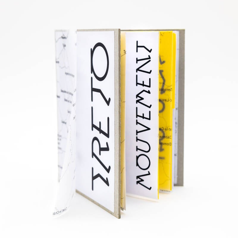
Pour en présenter l'usage, j'ai également réalisé une édition spécimen, présentent les enjeux et l'utilisation de La Treto.
To present its use, I also produced a specimen edition, presenting the challenges and the use of La Treto.
Une identité typographique
Dédier à un théâtre, cette typo titre permet alors de présenter les spectacles dans des affiches joyeuses et dynamiques.
Dedicated to a theater, this title typo allows to present the shows in joyful and dynamic posters.


Quelques Recherches
Some Research


Créez votre propre site internet avec Webador